Overview
The goal of this project was to create a company concept and branding for an ice cream shop, avoiding the typical cliches associated with ice cream brands. The concept for this brand is an ice cream shop modeled after a bar. Located just north of Downtown Lancaster City, this ice cream bar would cater to 18-24 year old college students who do not drink. This fills the need for a trendy hang out place for students at a local Bible college that has a strict policy against drinking and alcohol. After completing market research and a competitor analysis, a variety of naming options were generated. Of these options, Rocki best embodied the brand values. Rocki has an edgy tone and associations with both ice cream and bars. The ice cream association is through the popular flavor, Rocky Road, while the bar association is through the common term “on the rocks.”
Creative Process

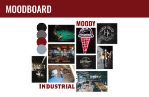
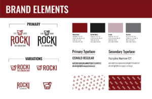
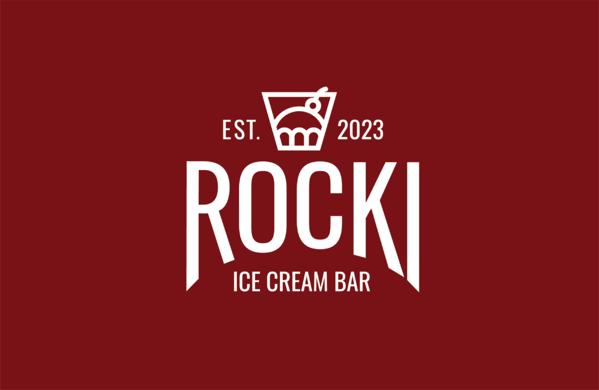
This moodboard captures the dark and moody atmosphere that Rocki seeks to achieve. The industrial vibe is consistent with popular bars in Downtown Lancaster. This moodboard informed the sketching process, which included both thumbnail sketches and rough drafts. Based on the sketches, three different logo directions were drafted in black and white. Each design direction went through a series of tests. They were then sent out to a focus group within the target demographic. The results of the tests and focus group decided which direction to move forward with. The primary logo seen below implements an icon reminiscent of a bar glass with ice cream while maintaining a simple, clean, and modern feel.

Collateral and Implementation
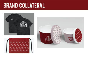
The brand collateral includes the team uniform and takeout ice cream cups. The uniform consists of a tshirt and a waist apron. It is simple, clean, and casual, fitting the branding of Rocki. The takeout ice cream cups come in two sizes, incorporating different brand colors, logo variations, and patterns to differentiate the two.


