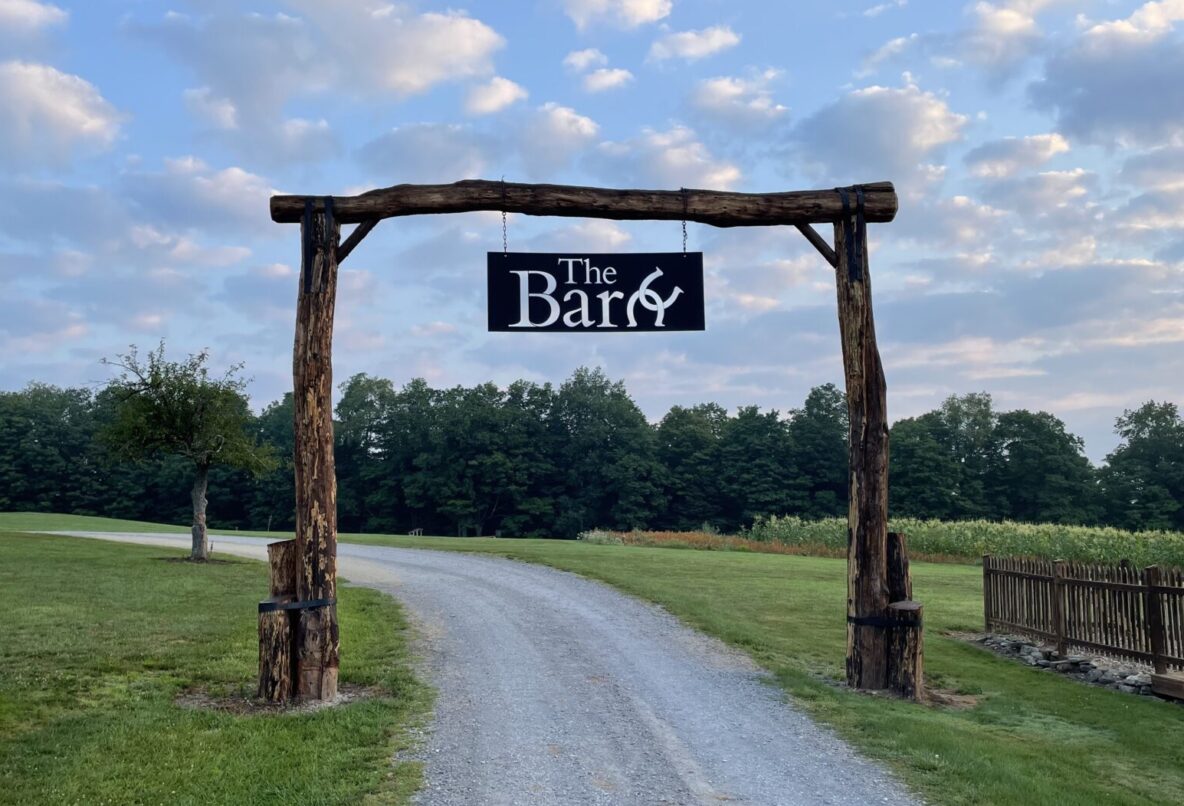
For this project, I worked with The Barn to complete a rebrand. The Barn is a part of a larger organization called Three Springs Ministries. The logo was to reflect elements of Three Springs Ministries’ parent logo, including the colors and typography. At the beginning of this project, I spoke with the director of The Barn and established their mission value, target audience, and project goals. Using this information, I compiled a project brief that informed the decisions regarding the rebrand moving forward.
I then moved into sketches before working in Adobe Illustrator. I created several logo variations, and created a brand guide complete with colors and the primary typeface. This branding package meets the project goals laid out in the brief and proposal. It is simple and clean, which was a requirement for the logo to be plasma cut on a steel plate for an archway. The horseshoe is a common symbol for horses, making the organization recognizable as a horse barn. The linked horseshoe also communicates the client’s value of connection. Using the same typeface and colors creates cohesion with the main Three Springs logo. The sign shown above now welcomes guests to The barn upon their arrival.


